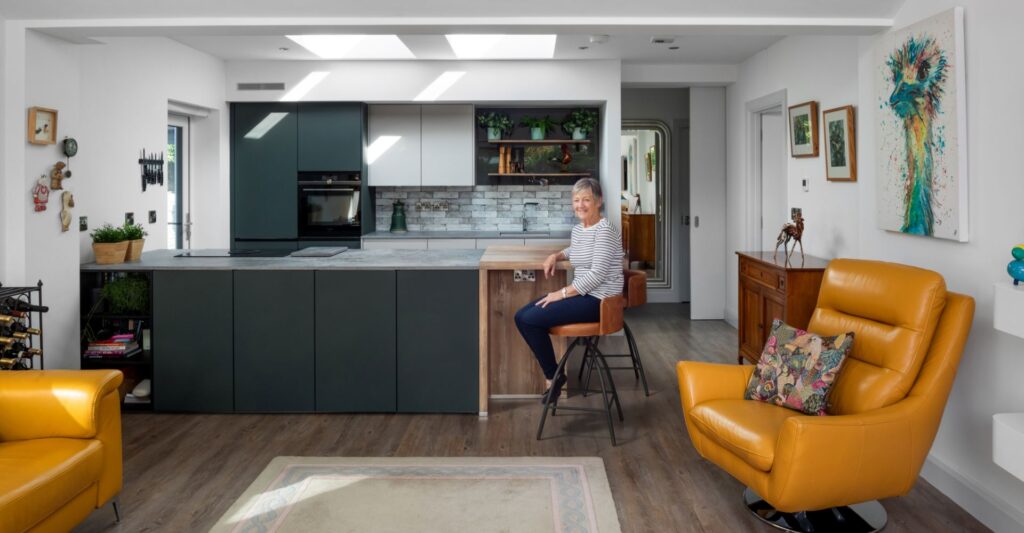
Linda, her husband Sean and their young family live in a welcoming family house, nestled in a quiet estate in the picturesque coastal village of Barna. On the outer edge of Galway City and the main gateway to Connemara, Barna fuses cool cosmopolitan with rustic charm and this is reflected in the newly remodelled kitchen which was designed and installed by the Surreal Design team using premium German kitchen technology.
The kitchen has everything a young family could ask for – bright open space, cosy quiet nooks, a comfy lounge area and a perfectly proportioned kitchen at the centre so that everyone can be together but doing their own thing.
When you walk into this modern, elegant kitchen you don’t know what to look at first as every single angle has something that catches the eye. The kitchen is undoubtedly the centrepiece and it complements the adjoining lounge and dining areas perfectly. The space is unrecognisable from the original kitchen which was very spacious but dark and uninviting.
The Surreal Brief
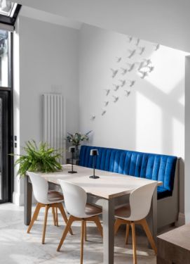
The Surreal Design team worked with the family not just to provide a stunning kitchen layout, but also to optimise the light and space to make it a living area full of joy and fun. The homeowner’s sense of style is evident with considered finishing touches like the custom-designed wall art of swallows in flight in the quiet sun-infused dining area. Our team very quickly realised that this would be a collaboration with the client very much involved at every stage.
We spoke to Linda to get her advice for anyone else considering a full kitchen remodel.
Here is what Linda had to say about the process:
What advice would you give when choosing a Kitchen supplier?
We spoke to several companies and you get a gut feeling – some just went straight into sales mode but Barry from Surreal asked questions and was genuinely interested in our story and what we wanted to achieve from the kitchen remodelling. I felt we were given time, and the atmosphere in the showroom was relaxed and easy. In other showrooms, the sales assistants were juggling between customers, answering questions without really taking time to listen or explain. To us, this was more than a new kitchen – it would radically change our home and the way we live so it was a big decision.
Why did you decide to go with Surreal Designs?
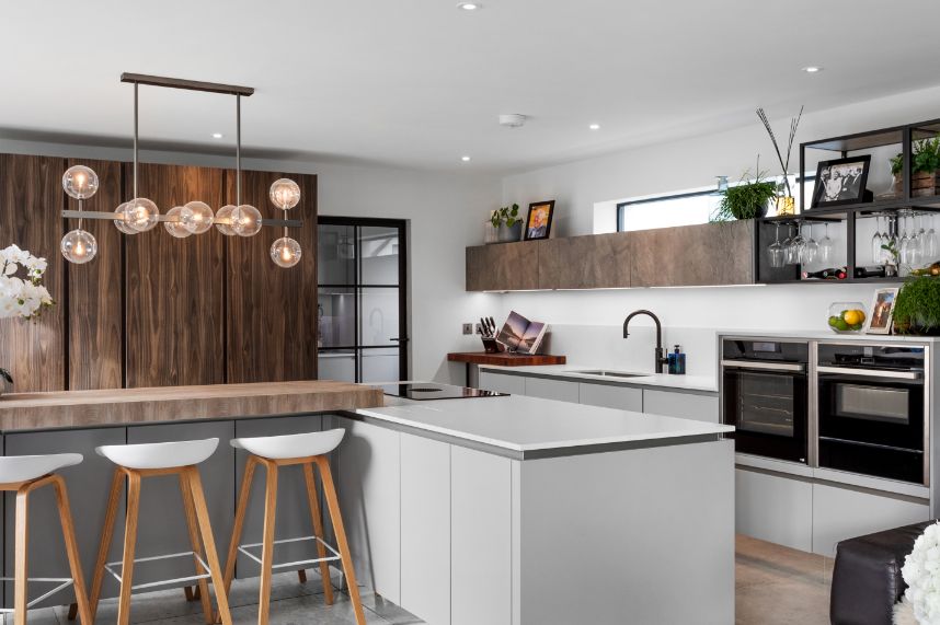
There was never any pressure. Barry suggested having an initial consultation with one of the Surreal designers to see if I felt that the fit was right and as soon as I spoke to the designer I knew that she was genuinely interested in my vision and ideas and that this would be a partnership, a fusion of ideas that would create a great living space. She gave us suggestions on the whole area, not just the kitchen. One of the ideas that we would never have considered was to block off the lower two-thirds of a large window to create more kitchen workspace. The long, narrow, high window that remained also became a feature, turning a misplaced window into something visually beautiful. During the consultation, we were given an overview of how to make the best use of the space. We looked at samples of worktops, doors and materials and then the designer brought combinations of sample materials together to create a mood board – we knew that Surreal was the right choice for us and paid the deposit.
How easy was the Surreal Kitchen Design process?
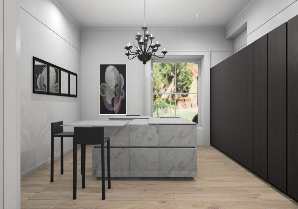
The 3D visualisation process is so helpful in ensuring that every detail is considered including how the light affects the kitchen. The designer was conscious of the open plan format and designed the kitchen around the children by creating safe areas with access to the fridge and food cupboards and a separate ‘hot triangle’ for cooking. The breakfast bar separates the kitchen and living areas but also provides an additional seating area when entertaining.
Did you experience any issues with the installation?
The team at Surreal organised everything and liaised with all the trade professionals so if there were issues, we didn’t know about them. Once fitted, the kitchen was thoroughly checked by Surreal before the final sign-off and handover.
How did you choose colours and materials?
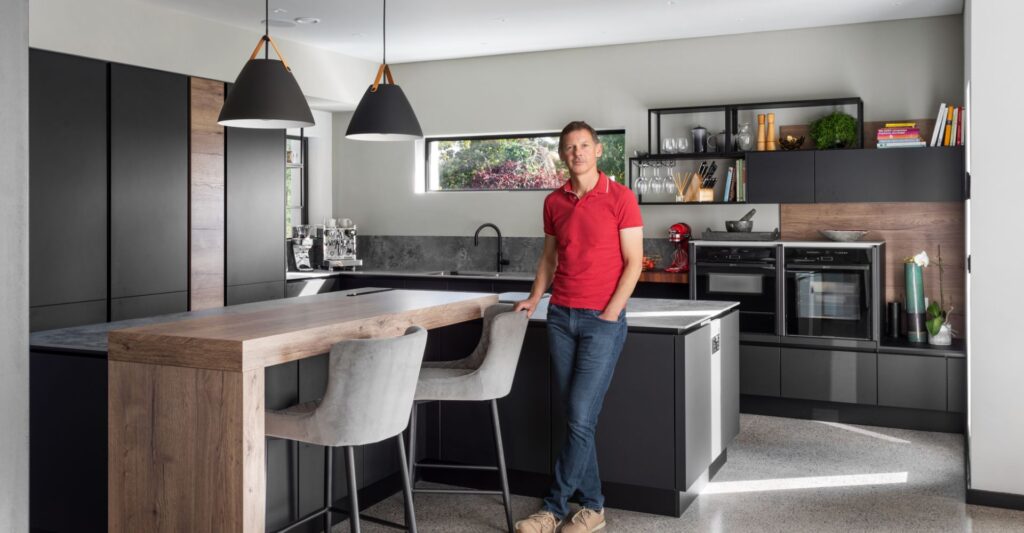
I wanted a bright, airy kitchen so I knew I wanted white walls and tones of light grey and cream for the floors. The light grey lower-level units and cream Caesarstone frozen terra quartz worktops continued this theme but Diane from Surreal pushed our boundaries and suggested a feature wall of floor-to-ceiling units in Okobo dark wood textured doors and it is fabulous. The wooden breakfast bar adds warmth to the kitchen – the mixture of materials used for the surfaces helps to create zones for different activities – dining, preparing food, chopping and cooking.
What is your favourite design feature?
The mirrored plinth on the lower units is very clever – it gives the illusion that the kitchen is suspended above the ground! I love the double waist-height ovens – they make it easy to keep an eye on the food as it cooks. The utility area is easily accessed, small and functional and keeps all the mess away from the main kitchen area. And the hidden power point and charging dock in the worktop so that we can charge our phones while cooking, and then the sockets disappear into the worktop when not in use!
What is your favourite appliance?
My Quooker tap – instant boiling water and not a kettle in sight!
How important is it to accessorise your kitchen?
Black metal open shelves were part of the original plan proposed by Surreal and I can see why – this area allows you to really personalise your kitchen. I use it to display my favourite wine glasses and family photos. I can use it for plants and flowers to change with the seasons.
Project Features
- Quality German kitchen cabinetry
- Space-saving and easy-access storage features
- Combination of engineered wood finishes to break up the kitchen into designated areas
Base units with mirrored plinths to give a freestanding effect - Induction hob with built-in extractor
- Concealed charging doc in the worktop
Be inspired… view our walk through
